Updating product reviews to reduce abandonment
Problem

50.1% of customers do not submit the product review form, leading to $12-36 million in unrealized revenue and savings
Strategy

identify and remove perceived barriers to completing the product review form quickly and easily
Results

5% reduction in form abandonment while improving review quality
Timeline

design handoff in October 2024
Team

myself and Karlie (manager)
Erinn and Jeff (product), Trang (engineering)
I led the redesign of the product review form on Best Buy’s website and native app, improving the perceived simplicity and ease of completion for customers. The form is a vital piece of user-generated content product portfolio and the sole information collection point for all of Best Buy’s product ratings and reviews experiences.
During the initial stages of the project, it became clear there were a number of ways the form could be distilled down to look and feel easier to complete. Some outdated questions were removed, some optional content was hidden unless active, and some important content was simplified.
Redesigned review form
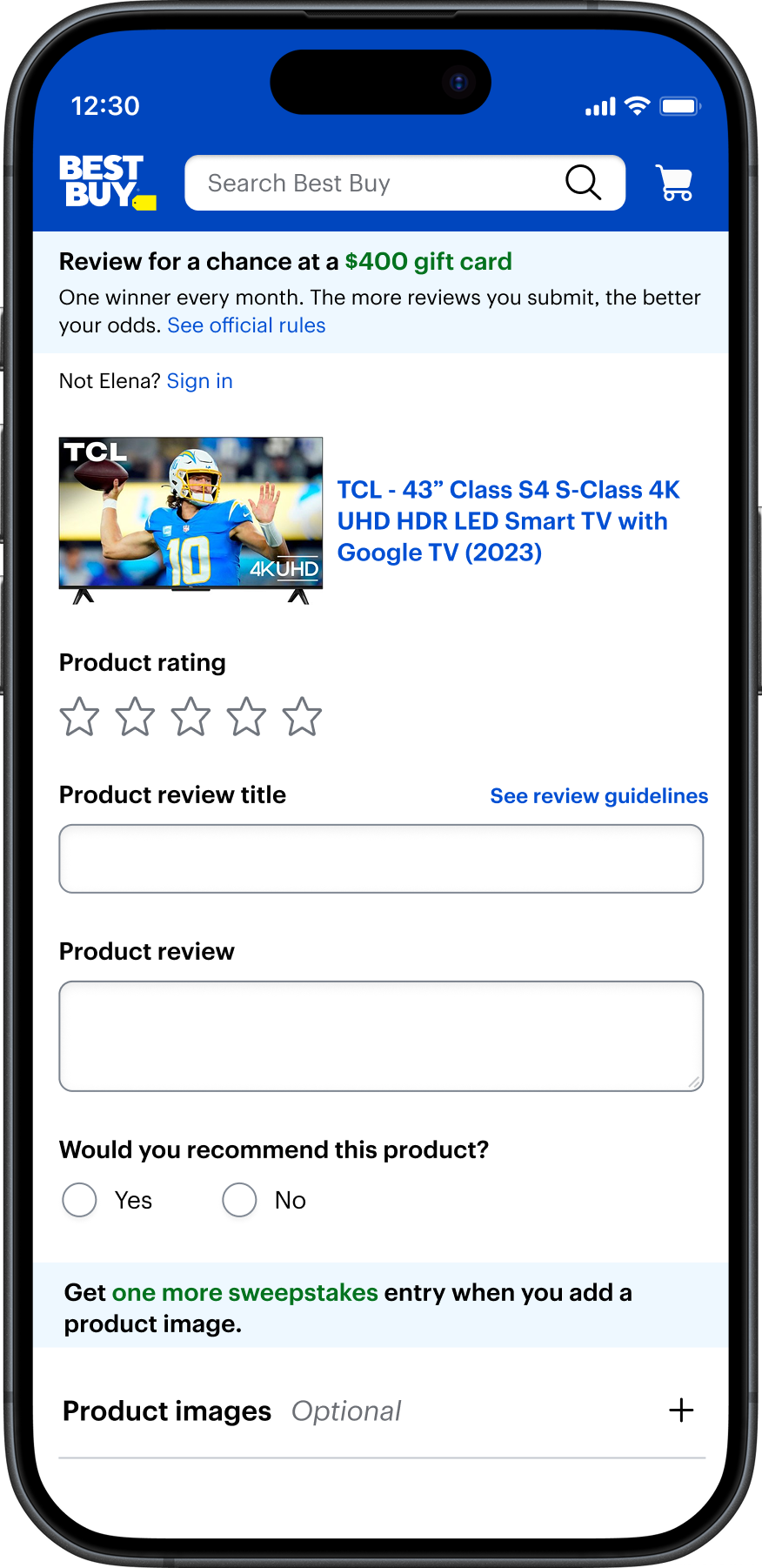
Incentive messaging was edited and redesigned for clarity and also highlighted for visibility.
UI for customers to upload their own product photos was collapsed to reinforce the optional nature of the feature and reduce the visual complexity of the form.
Hidden instructional text
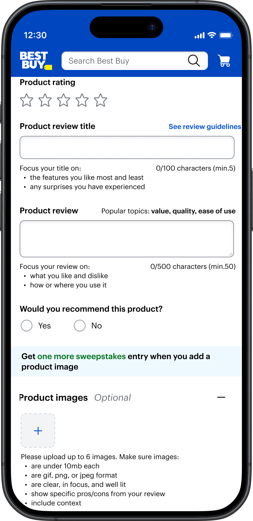
Instructional text for the title and review fields was added to aid customers’ completion of those fields and keeping response focus and quality high.